 Foshan Xinliheng 스테인레스 스틸 Co., Ltd.(佛山市鑫利恒不锈钢有限公司)

I still remember the exact moment my perception of stainless steel shifted forever. I was in a warehouse, surrounded by stacks of metal sheets, most of them gleaming aggressively under the fluorescent lights or covered in that ubiquitous blue protective film with “LASER-FILM” printed on it. Out of curiosity, I grabbed a corner of the film on one particular sheet and peeled it back. What revealed itself wasn’t the cold, mirror-like surface I expected, nor was it the industrial grey of a factory floor. Instead, I was met with a soft, muted pale blue surface that seemed to absorb the light rather than reflect it. It looked… gentle. Not physically soft, of course, but visually and tactility warm, like a surface brushed by morning mist. It felt more like high-end matte paint or fine sandpaper than metal. That was my first encounter with colored frosted stainless steel, and it completely dismantled my stereotype that stainless steel belongs only in hospital corridors, 엘리베이터 캐빈, or commercial kitchens.
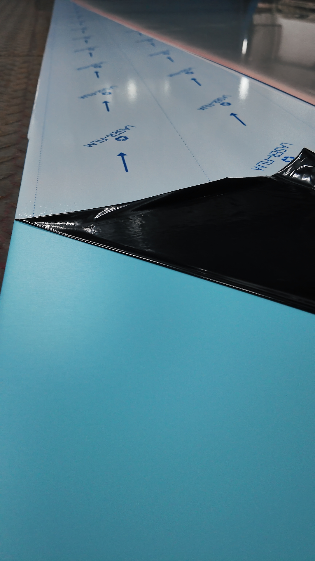
For years, the global market has treated stainless steel as a purely functional material: durable, yes, but aesthetically limited to “shiny silver” 또는 “brushed grey.” We’ve been told it’s hygienic, fire-resistant, and strong, but rarely have we been told it’s emotional or atmospheric. Yet, walking through recent architectural projects in Europe, boutique hotels in Asia, and luxury retail spaces in the Middle East, a quiet revolution is happening. Designers are increasingly turning away from volatile organic compound (VOC)-heavy paints and fragile wallpapers, opting instead for colored frosted stainless steel. They’ve realized that metal doesn’t have to shout; it can whisper. It can be the quiet, sophisticated backdrop that lets the rest of the design breathe.
The magic lies in the finish. The term “무광” 또는 “satin” refers to a specific surface treatment where the metal undergoes a precise abrasive process to create microscopic peaks and valleys. This texture scatters light diffusely, eliminating the harsh glare and mirror reflections that make traditional stainless steel feel so clinical. When you combine this texture with color—achieved not by painting, but through advanced Physical Vapor Deposition (PVD) coating technology—the result is stunning. PVD involves depositing thin layers of metal ions onto the stainless steel substrate in a vacuum chamber. Unlike paint, which sits on top and can chip, peel, or fade, the PVD layer becomes an integral part of the metal’s surface. The colors available today are incredibly nuanced: think Champagne Gold, 로즈 골드, Slate Grey, Smoky Blue, Antique Bronze, and even deep Emerald Green. These aren’t the garish, neon hues of the past; they are low-saturation, earth-toned palettes that mimic natural materials like stone, aged copper, or ocean fog.
From a practical standpoint, especially for international buyers and specifiers, the advantages are overwhelming. Let’s talk about the nightmare of maintenance. Anyone who has specified mirror-finish stainless steel knows the struggle: it is a fingerprint magnet. A single touch leaves a visible mark; a splash of water dries into a spot; a slight scratch catches the light and ruins the illusion of perfection. In high-traffic areas like hotel lobbies, airport terminals, or busy family homes, this is a dealbreaker. Colored frosted stainless steel solves this elegantly. The textured surface naturally camouflages fingerprints, smudges, and minor abrasions. Light hits the micro-irregularities and bounces off in all directions, effectively hiding the daily wear and tear that would be glaringly obvious on a smooth surface. For facility managers and homeowners alike, this translates to significantly lower cleaning costs and less frequent polishing. A simple wipe with a damp cloth and a neutral detergent is often all that’s needed to restore its pristine look.
Durability is another pillar where this material shines. Because the color is bonded at a molecular level via PVD, it offers exceptional resistance to corrosion, UV radiation, and abrasion. Whether installed in the humid coastal climates of Southeast Asia, the freezing winters of Northern Europe, or the arid heat of the Middle East, colored frosted stainless steel remains stable. It does not rust (provided it’s 304 또는 316 등급), it does not fade under sunlight, and it does not warp with temperature fluctuations. Compare this to wood veneers that might delaminate, paints that crack, or laminates that bubble in humidity, and the value proposition becomes clear. It is a “install and forget” material with a lifecycle that can easily span decades, making it a sustainable choice in an era where longevity is a key metric of eco-friendly design.
그러나, sourcing and specifying this material requires a keen eye. Not all “colored stainless steel” is created equal. 시장에는 전기도금이나 단순 도장 방식을 사용하는 더 저렴한 대체품이 넘쳐나고 있습니다., 이들 제품은 진정한 PVD 코팅의 내구성과 깊이가 부족합니다.. 수입업자나 디자이너로서, 기본 강재의 등급을 반드시 확인해야 합니다. (인테리어에는 항상 SUS304를, 외부나 해안 지역에는 SUS316을 요구해야 합니다.) PVD 층의 두께도 확인하십시오.. 고품질 PVD 코팅은 박리 없이 엄격한 염수 분무 시험과 접착력 시험을 통과해야 합니다.. 게다가, 일관성이 핵심입니다.. 대규모 프로젝트에서는, 배치별 색상 차이가 큰 문제가 될 수 있습니다.. 평판 좋은 제조업체들은 컴퓨터 제어 진공 챔버를 사용하여 “Smoky Blue” 1월에 주문한 제품이 6월에 도착하는 배송과 완벽하게 일치하도록 보장합니다.. 대량 주문을 결정하기 전에 항상 실물을 요청하십시오.. Look at the sample under different lighting conditions—natural daylight, warm indoor light, and cool LED light—to see how the color shifts and interacts with the environment.
Installation also demands a level of expertise that goes beyond standard metalworking. While the material itself is robust, the aesthetic appeal relies heavily on precision. The direction of the grain (그만큼 “헤어 라인” of the frost) must be consistent across all panels; otherwise, the wall will look patchy and disjointed under light. Seams and joints need to be handled with surgical precision. Unlike painted walls where touch-ups can hide mistakes, metal reveals every imperfection. This is why working with experienced fabricators and installers is non-negotiable. They understand how to handle the protective film (which usually comes in blue, 흰색, 또는 레이저 프린팅으로 결 방향을 표시하는 방법), 가장자리를 태우지 않고 절단하는 방법, 그리고 설치 후 표면을 자국 없이 깨끗이 닦는 방법.
컬러 프로스티드 스테인리스 스틸의 다재다능함이 아마도 가장 매력적인 특징. 산업과 고급 사이의 간극을 잇는다. 미니멀리스트 스칸디나비아 거실에서, 프로스팅된 무광 흰색 스테인리스 스틸 패널이 전통적인 석고를 대체할 수 있다, 겨울 낮은 햇살을 받아도 눈이 멀지 않게 미묘한 금속성 광택을 더한다. 고급 보석 매장에서, 서리가 낀 검은색 스테인리스 스틸은 극적인 배경을 제공, 다이아몬드를 돋보이게 하는 벨벳 같은 배경. 기업 사무실에서, 서리가 낀 청동 칸막이는 통풍을 유지하면서도 사생활을 제공, 개방적인 느낌, 석고보드의 무거움이나 유리의 투명함을 피한다. It adapts to the style of the space rather than dictating it. It can be embossed with patterns for added texture, perforated for acoustic control, or bent into complex curves for sculptural installations.
There is also a psychological aspect to consider. Interior design is increasingly focused on wellness and biophilic principles. Harsh, reflective surfaces can cause visual fatigue and stress. Soft, diffused surfaces promote calmness. Colored frosted stainless steel, with its light-scattering properties and warm, naturalistic color palette, contributes to a serene atmosphere. It feels solid and grounding, offering a sense of security, yet its softness prevents it from feeling imposing. It’s a material that invites touch. People want to run their hands over it, a reaction rarely elicited by cold, shiny metal or sterile white paint.
As we look toward the future of construction and interior design, the demand for materials that combine aesthetics, performance, and sustainability will only grow. Colored frosted stainless steel checks every box. It reduces the need for frequent renovations, minimizes chemical cleaning agents, and offers a timeless look that doesn’t succumb to fleeting trends. For architects, 디자이너, and distributors looking to differentiate their offerings, this material represents a significant opportunity. It’s no longer just about covering a wall; it’s about creating an experience.
So, the next time you are specifying materials for a project, don’t dismiss stainless steel as too cold or too industrial. Peel back the blue film, look closer at the frosted textures, and explore the spectrum of PVD colors. You might find that this “new” old material is exactly what your project needs to elevate it from ordinary to extraordinary. It’s not just a sheet of metal; it’s a canvas for light, shadow, and human connection. The era of the “cold” stainless steel is over; welcome to the age of the温柔 (gentle) metal.
A Note to Global Partners:
If you are sourcing this material for your next project, remember that the devil is in the details. Ask for test reports, verify the PVD process, and never compromise on the base steel grade. The difference between a good supplier and a great one isn’t just price—it’s consistency, technical support, and the ability to deliver a vision that lasts. Let’s build spaces that don’t just look good today, but stand the test of time.
If you are sourcing this material for your next project, remember that the devil is in the details. Ask for test reports, verify the PVD process, and never compromise on the base steel grade. The difference between a good supplier and a great one isn’t just price—it’s consistency, technical support, and the ability to deliver a vision that lasts. Let’s build spaces that don’t just look good today, but stand the test of time.
